Custom Curves
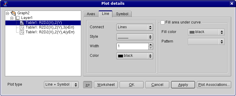
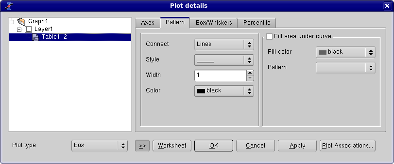
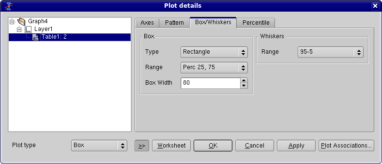
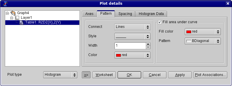
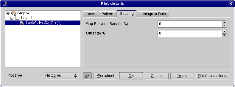
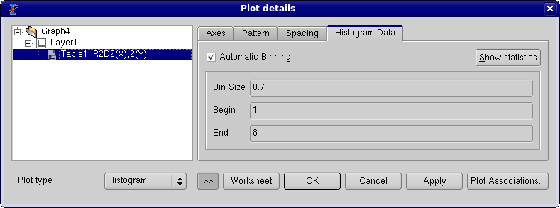
This dialog is activated by selecting the command Plot... from the Format Menu. It is also activated by a double click on the plot. If there are more than one layer in the window, SciDAVis will select the layer which contain the plot under the mouse pointer.
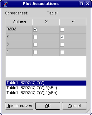
The right part of the dialog box contains several tabs which depend on the kind of plot that you are using, they are described in the following subsections. The left part of the dialog window shows the curves which are plotted in the active layer. All the modifications will be done on the selected curve. You can change the columns which are used by clicking on the Plot Associations... button. This will open a dialog which can be used to select the columns of the table which are used as X and Y values.
The button Worksheet can be used to access to the table which contains the columns selected.
Custom curves for lines and scatter plots
This dialog box is activated for plots drawn with symbols, line+symbols, lines, vertical drop lines, steps and splines.
The first tab of the right part of the dialog window allows to modify the style of the line (color, line style, thickness). The connect button allows to change the style which is used to draw the selected curve (steps, droplines, etc). See the Plot menu to see the different types of plot available.
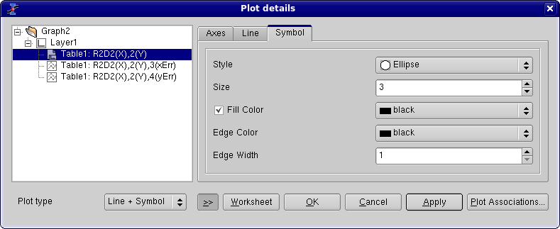
A second tab can be activated to select the symbol, and to modify the size, the color and the filling color of the symbols.
Custom curves for pie plots
These commands are available for pie plots. The first tab allows the customization of the pie segments. The left fields are used to modify the border which is drawn round each segment: color, type and width of line. The default is no border (line width = 0).
The right fields are used to define the filling of the plots. The color button defines the one used for the first segment, then the others segments will have colors which follow the order defined in the list. The default value for this field is black, so segment 2, 3, etc will be red, green, etc.
The pattern will be used for all segments of the pie, the default value is solid filling. The last field defines the size of the pie in pixels.
