Chapter 2. Drawing plots with SciDAVis
- Table of Contents
- 2D plots
- 3D plots
- Multilayer Plots
2D plots
A 2D plot is based on curves which are defined by Y values as functions of X values. There are two ways to obtain a 2D plot depending on the way the (X,Y) values are defined:
You can have your (X,Y) values in a table. You need to select at least one column as X values and one column as Y values. This is specified with the Column Options... command. Then you can select the columns and use one command of the Plot menu to plot the data.
If you want to plot a function, you don't need a table. You can use directly the New -> New Function Plot command. This will open the corresponding dialog box and you will be able to define the mathematical expression of your function.
The combined way is to define a table, and then to fill in the table with the results of functions. This can be done with the Set Column Values... command. Then you can select the columns and use one command of the Plot menu to plot the data.
SciDAVis will create a new plot window, and the plot will be inserted in a new layer
Once the plot is created, you can customize all the graphic items of the plot with the commands of the Format Menu. You can add new items (text labels, lines or arrows, new legend, images) on the plot with the commands of the Graph Menu.
2D plot from data.
The data must be stored in a table. There are several possibilities to insert your (X,Y) values in the table: you can write them directly from the keyboard, or read them from a file. Here we will use the first solution, refer to the Import ASCII command to use the second one.
The first step is to create an empty project with the New -> New Project command from the File menu, you can also use the key Ctrl-N or the ![]() icon from the File toolbar. Then create a new table with the New -> New Table command from the File menu or with the Ctrl-T or with the
icon from the File toolbar. Then create a new table with the New -> New Table command from the File menu or with the Ctrl-T or with the ![]() icon from the File toolbar.
icon from the File toolbar.
At its creation, the table has two column (one for X and one for Y) and 32 rows. You can add rows and columns by selecting a row or a column and using the right button of the mouse, you can also modify the number of rows and columns with the Rows command and Columns command from the Table menu. You enter your values, and obtain this table:

The you have to select the two columns, and build your plot (here a simple 2D scatter) with the Scatter command from the context menu, or by clicking on the corresponding ![]() icon from the Plot toolbar or with the Scatter command from the Plot menu. A plot is created which uses the default options for all elements. You can customize these default options with the preferences dialog. With the default options, you obtain the following plot:
icon from the Plot toolbar or with the Scatter command from the Plot menu. A plot is created which uses the default options for all elements. You can customize these default options with the preferences dialog. With the default options, you obtain the following plot:

You can then customize your plot. By double clicking on the points, you open the Custom curves dialog which is used to modify the symbols. Then a double-click on the axes opens the general plot options dialog, and you can change the scales, the fonts for the axes labels, etc. You can also add grid lines on X or Y axes, etc. Finally, a double click on each text item (X title, Y title, plot title) allows to change the text and the presentation of these elements. The final plot is:

Finally, you have to save your project in a '.sciprj' file with the Save Project command from the File menu or with the Ctrl-S or with the ![]() icon from the File toolbar. Depending on your application, you can export your plot to a standard image file with the command Export Graph -> Current command from the File menu (or with the Alt-G keycode).
icon from the File toolbar. Depending on your application, you can export your plot to a standard image file with the command Export Graph -> Current command from the File menu (or with the Alt-G keycode).
There are several types of plots which can be built from a table. They are presented in the Plot menu
It is possible to use up to four axes for the data:

In addition to the customization which has been already described, the axes which are used for each curve were defined with the Custom Curves Dialog, and two arrows were added with the Draw Arrow command.

2D plot from function.
There are two ways to obtain such a plot: you can plot directly a function or fill a table with the values calculated from this function before doing a plot in the classical way.
Direct plot of a function.
If you just want to plot a function, you can use the New -> New Function Plot command from the File menu or with the Ctrl-F or with the ![]() icon from the File toolbar.
icon from the File toolbar.
This command will open the Add Function Curve dialog. You can then enter the expression of your mathematical function, the X range used for the plot, and the number of points used in this X range. Beside classical Y=f(X) functions, parametric and polar functions can be defined.

Filling of a table with the values of a function.
If you just want to work not only with the plot but also with the data, you can create a new table as explained in the previous section. Then you can fill this table with the values of a function with the Set Column Values... command.
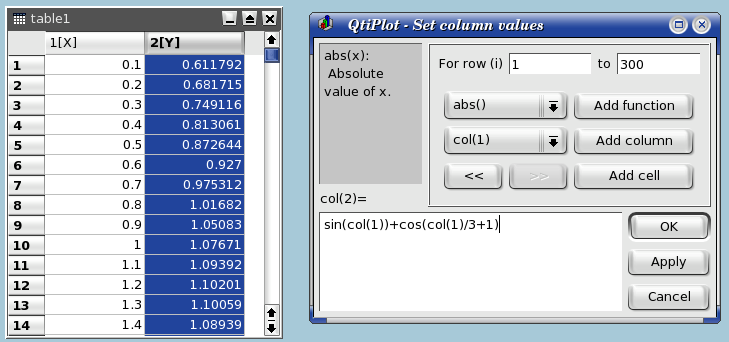
To obtain the same plot as in the previous example, you need to create a new table (key Ctrl-T), then select the first column and use the command Set Column Values... command from the context menu, or from the Table menu. The row number symbol is i, so you can enter the function expression i/10 and use 300 rows.

The second step is to select the second column and use the same command. The expression is a function of the X values, that is the first column named col(1).
Once the table is ready, you just have to build the plot as explained in the previous section.